Rail Alphabet survivors at March station
Rail Alphabet is beautiful. It was everywhere on the railway network for decades; for people over a certain age, it is a typeface that says "railway" almost as surely as a double-arrow symbol does, and as surely as "Transport" says "road". It was so ubiquitous that one could associate that typeface with railways even if you do not know it is a distinct, single-purpose typeface - a fact I only learned in recent years thanks to Nick Job's beautiful digitisation of the British Rail Corporate Identity Manual.
Post-privatisation, much Rail Alphabet signage was replaced, usually with weaker typefaces chosen for coherence with a train operator's brand. Rail Alphabet lives on, though precariously, at lesser-loved stations. Those remnants that have survived privatisation might be doubly endangered in the upcoming Great British Railways rebranding.
March - once a major junction, and still has something of the feel of one despite route cuts from the 60s onwards - is one of those lesser-loved stations. It was on my mind that March is undergoing refurbishment, and that it might not keep any of its Rail Alphabet for very long. So, I paid a visit to the station on Thursday to see how much Rail Alphabet was left. As expected, the in-progress refurbishment has replaced or removed much of it, but there were still some lovely survivors on my visit.
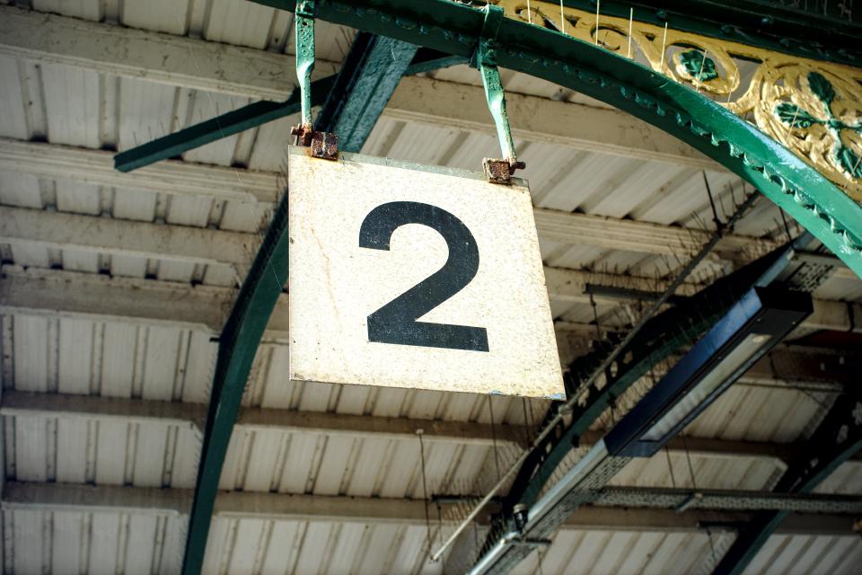
Let's start with Rail Alphabet's distinctive "2", on Platform 2. Rail Alphabet is more likely to survive on platform number signs than it is anywhere else, because who would think they could improve on the clarity and function of this?
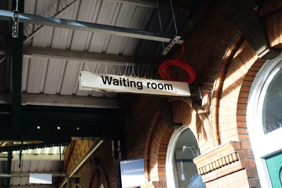
Here's a "Waiting room" sign, which indicates a waiting room, next to a non-BR "Customer Services" sign that does not indicate a place for customers to get service:
Compare this with the reference plank from Job's digitisation of the Manual. It looks as though it may have had a pictogram on it at one point which has been painted over since, or perhaps it should have had a pictogram on it and never did.
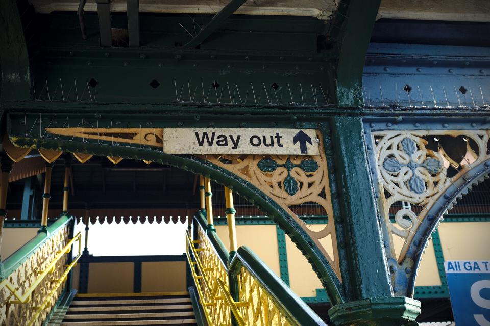
Over at the footbridge on Platform 2, there is a "Way out" sign with one of those beautiful pictograms. This sign was likely truthful when it was installed. Over the years, this has become misleading, and rather charmingly so; the nearest way out is about 15 feet to the left of this sign, along a footpath that crosses the former trackbed for the disused platforms.
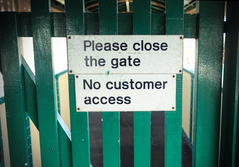
On the footbridge, is more Rail Alphabet. The gate guards the section of the footbridge that leads to the disused platforms. As I did not open it, I was unable to comply with its polite request to close it.
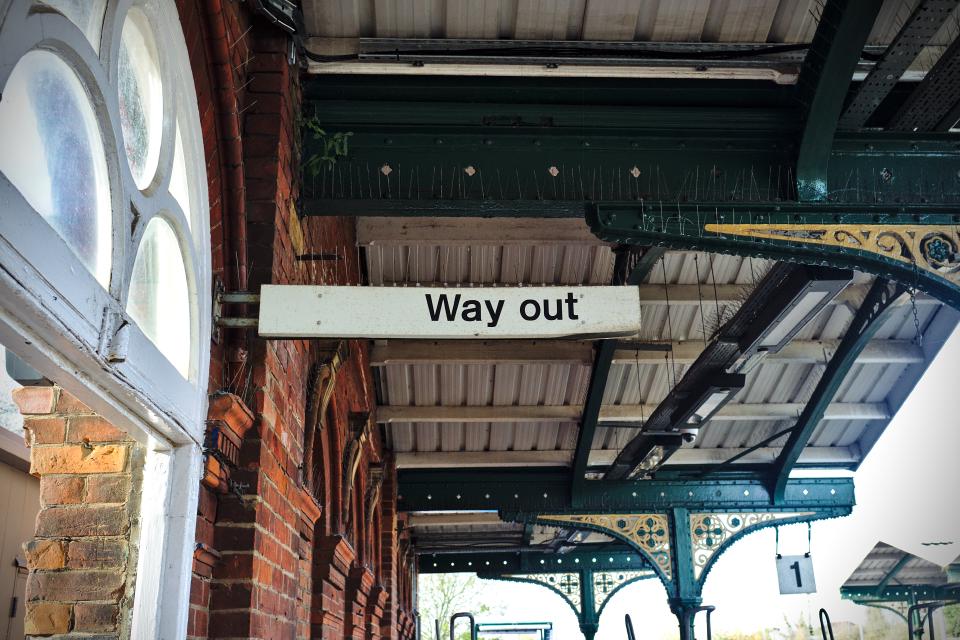
There is another "Way out" sign on Platform 1. It scores one point over Platform 2's sign for veracity, but loses that point due to lack of chunky directional arrow.
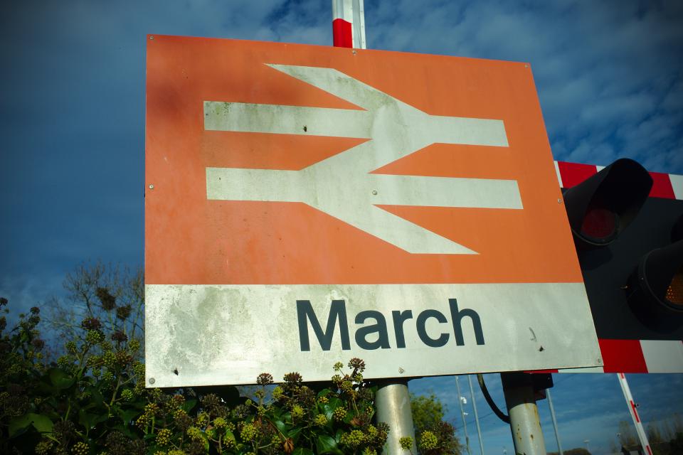
Outside the station was much less exciting. Most of the British Rail era signage has disappeared in its current refurbishment, but the station sign at the level crossing nearby is still fully British Rail and still entirely glorious.
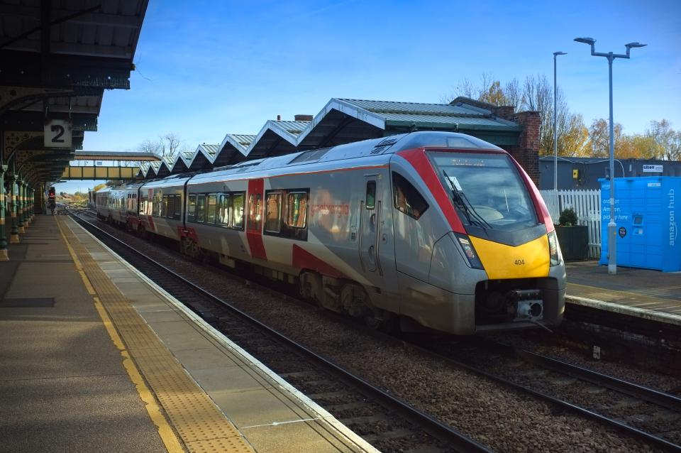
And finally, apropos of nothing other than that I really like them (the best reason possible), here's a Greater Anglia class 755 unit I saw while killing time at March.
Psst: I've uploaded all the photos above, and others from my visit, to the Wikimedia Commons, where they are available in full resolution and under a liberal license. See the station's category, which has photos by many people other than me, and in particular the signage subcategory, which does not.
