Two code snippets for making a Hugo site even faster
This site is pretty fast.
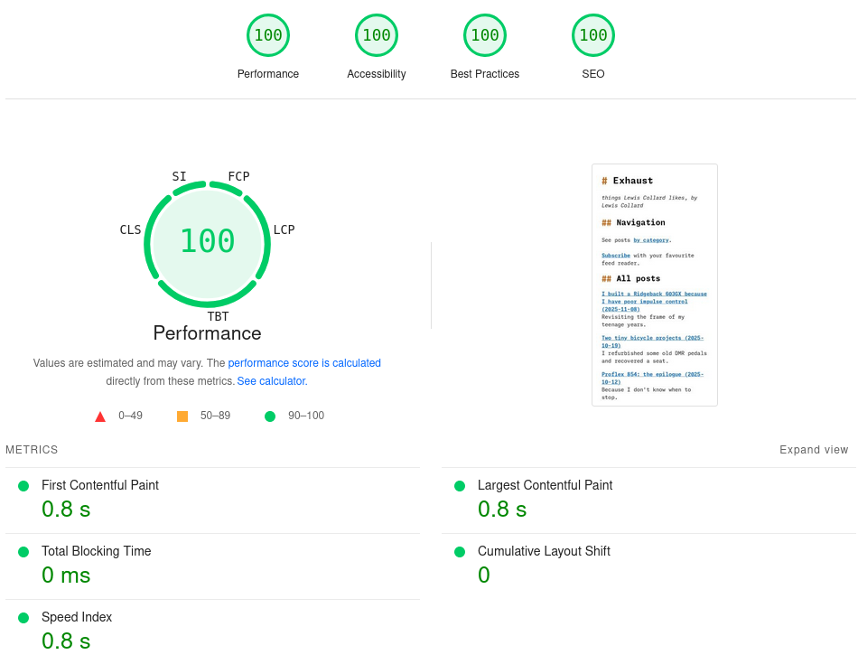
Obviously, this is mostly because I used a static site generator to build it. That static site generator is called Hugo, which I spoke about before. It is always going to be much faster to send an HTML file over a socket than it is to render an HTML file for each request based on some thing read from a database.
There's a couple more things I do. You can copy-paste my stuff. And these are not just tricks to game Google Pagespeed Insights; it helps this site load instantly on any Internet connection that you are likely to encounter.
Inline all your CSS
Show the code
Put this at the top of your baseof.html or wherever else you have your stylesheet, obviously changing the path to your resource as appropriate (and if you're not Sass, change or remove the toCSS filter):
{{ with resources.Get "scss/styles.scss" | toCSS | minify }}
    <style>{{ .Content | safeCSS }}</style>
{{ end }}
Assumption: your CSS is trustworthy and relatively small. Minus about 50 lines of a reduced version of Meyer's good old CSS reset, I wrote all the CSS on this site, so mine is mostly trustworthy and quite small.
What: this inlines ALL of your CSS into a <style> tag at the top of your page.
Why: this dodges a network round trip to fetch the CSS, which is required to render your page. If your stylesheet only includes what is necessary for your blog, it's likely to be very small, and so there is no identifiable benefit to inter-page caching. Mine weighs in at about 8 kilobytes, but this is before gzip compression on the HTML body, which brings it down to somewhere around 2 kilobytes.
Wait, gzip compressing page bodies breaks HTTPS!
It does not break HTTPS for a statically-generated site, because by definition every URL will always result in the same HTTP response for all users. A response can never reflect any aspect of the request.
Remember that browsers are loading and parsing the CSS whether it's inline or not. If your stylesheet seems uncomfortably large when inlined, then it's uncomfortably large and you need to fix that.
What if my CSS is hosted by a CDN?
Stop it!
There's absolutely no reason to do this in Current Year other than convenience (pasting some <link> tag into your document rather than working out the best way to host it yourself).
There is no caching benefit since about 2020 due to browser cache partitioning. It is no longer merely somewhat unlikely that a browser will load a cached version of files from a CDN because they happened to visit some other site that requested the same file; it is impossible.
There used to be a separate benefit because it allowed the CSS to be loaded on a concurrent connection. That went away with HTTP/2 pipelining; it is always more efficient to serve a resource from the same origin.
This includes webfonts! It'll always be faster to serve both the font kit CSS and the font files themselves from your site.
WebP and lazy-load all your images
Show the code
Put this in your layouts/_markup/render-image.html.
Change the value "960" to the maximum width at which images are displayed on your site.
{{/*
    A template to override image rendering in an article body.

    It ensures that images are no larger than they need to be, re-purposes the
    "title" attribute of an image to work as image captions displayed
    underneath, lazy-loads images, and outputs webp versions using
    picture/source elements.

    Note that this will cause Hugo to throw an error if the source does not
    exist and if it is not a valid page resource. This is a feature, not a
    bug.
*/}}

{{- $caption := .Title -}}
{{- $alt := .Text -}}
{{- $image := .Page.Resources.GetMatch (.Destination) -}}

{{ if not $image }}
    {{ errorf "Resource not found: %s" .Destination}}
{{ end }}

{{- if $caption -}}
    <figure class="figure">
{{- end -}}
<div class="image">
    <a href="{{ $image.RelPermalink }}" class="image__link">
        {{/*
        Only bother with thumbnailing if the image is very large. Otherwise
        just dump it as-is into the body; it'll be fine.
        */}}
        {{ if gt $image.Width 960 }}
            {{/* Smaller version of the original format, for older browsers that don't understand WebP. */}}
            {{ $orig_resize := $image.Resize "960x" }}
            {{/* WebP version for browsers with larger windows. */}}
            {{ $webp_resize := $image.Resize "960x webp" }}
            {{/* WebP for browsers with windows <= 600px, i.e. phones. */}}
            {{ $webp_resize_small := $image.Resize "600x webp" }}
            <picture>
                <source media="(width < 601px)" type="image/webp" srcset="{{ $webp_resize_small.RelPermalink }}">
                <source media="(width >= 601px)" type="image/webp" srcset="{{ $webp_resize.RelPermalink }}">
                <source srcset="{{ $orig_resize.RelPermalink }}" type="{{ $image.MediaType }}">
                <img
                    class="image__image"
                    loading="lazy"
                    src="{{ $orig_resize.RelPermalink }}"
                    width="{{ $orig_resize.Width }}"
                    height="{{ $orig_resize.Height }}"
                    style="aspect-ratio: {{ $orig_resize.Width }} / {{ $orig_resize.Height }}"
                    alt="{{ $alt }}"
                >
            </picture>
        {{ else }}
            <img
                class="image__image"
                loading="lazy"
                src="{{ $image.RelPermalink }}"
                width="{{ $image.Width }}"
                height="{{ $image.Height }}"
                style="aspect-ratio: {{ $image.Width }} / {{ $image.Height }}"
                alt="{{ $alt }}"
            >
        {{ end }}
    </a>
</div>
{{ if $caption }}
        <figcaption class="figure__caption">{{ $caption }}</figcaption>
    </figure>
{{ end }}
Assumptions: that you use images on your site the way I do.
They're embedded in the body of your post with the standard  Markdown syntax, and the images are displayed at the full width of the page.
You store the images alongside your post, in the same directory.
What: Every time you reference an image in your post, three versions will be generated from it.
A large WebP version (960 pixels wide, same as the maximum body width on this website, so change that number to suit your site),
a smaller WebP version (600 pixels wide) for smaller screens such as phones,
and also a 960-pixel-wide version in whatever the original format was for ancient and weird browsers which don't support WebP.
It adds loading="lazy" to the img tags, and the correct width and height attributes.
Why bother with ancient browsers?
I care that my site is at least usable in weird minority browsers such as Netsurf, Servo and others. Older mainstream browsers (like people who can't upgrade the browsers on their phones) are a bonus.
That doesn't mean it looks the same in all those weird browsers, just that you can read the text and load the images. It is no real extra effort, and anyway nobody's paying me to do this so I can do whatever I want.
As some bonuses, it repurposes the title from the Markdown image tag as an image caption to be displayed under the image, rather than as a title attribute.
It also wraps the image in a link to the original full-size image.
It's easy to delete those bits if you don't want them.
Why: WebP is much more efficient for most types of image than older formats.
It might slightly annoy me that Google rather unilaterally forced this format on the Web, but that is the world we got.
But it's also good to have a link to the high-resolution version in the original format.
People will save images from your site, so it's best that they don't save degraded ones.
It is also good to add loading="lazy" to all images and let the browser decide whether to render them.
The width and height attributes prevent layout shift as the user scrolls down the page.
I used to use a shortcode for this, and it was only after I wrote it and rewrote all my posts to use it during the migration to Hugo that I could have just changed how all images are rendered by overriding a template. It was all documented so I don't have that excuse!